Monday, November 23, 2009

Design in a city

In the past blog, Curitiba, Brazil was introduced as a sustainable place, and I expressed my fascination I have for this place. Now, I want to explain why.


This city went from being an undesirable place to live in to a more sustainable place. Before, poverty was consuming people’s interest for survival. Overpopulation did not help to improve the living conditions in the site. According to the
PreDesign Word Press, it “increased by about 900 people each week for a period of 40 years,” and the economy did not improve as the population grew.

The need to redesign the systems thinking (in other words and in this case, the way the government was taking care of their people) of Curitiba was crucial because the quality of the site was declining rapidly. Then in 1965 a Master Plan was proposed by the architect and urban planner, an current major of the place, Jaime Lerner. As many of the past blogs have mention, design plays a role in every field, in this case architecture and the redesigning of Curitiba.

Lerner decided that there was a need of rethink the way society was living in Curitiba. The main goal was to improve the quality of life at the site; therefore the goal was to “provide economic support for urban development.” The systems thinking that Lerner applied was to educate the people about recycling, reusing, and reduce. He changed systems thinking in the site and the people's way of viewing their hometown. They no longer saw their government as an institution that only wanted to take advantage of their people, now they worked along with them.
He re-designed the transportation system, as mentioned past blogs; he created a massive transportation system that involved the reusing of existing buses, instead of building a new underground transport system. But, not only did he improve the transport system, but the quality of living at the site, because he improved the cultural value the community had for their city.


Furthermore, Lerner changed the ethics of the society by providing a better quality of education and by teaching the community to be more sustainable and self-sufficient. He additionally redesign the society's interaction towards its own community; thus, he created more of a sense of community in the city.
Lerner not only redesigned the aesthetics of the site, and the ethics of the place, but his new approach to design transformed the entire place from being an unsustainable place to live, where overpopulation and poverty were the main issues, to being a sustainable model for the entire world.


References:
http://www.dismantle.org/curitiba.htm
http://predesign.wordpress.com/2007/04/17/sustainable-history-of-curitiba-brazil-13/
http://www.nytimes.com/2007/05/20/magazine/20Curitiba-t.html

Photos:
http://farm3.static.flickr.com/2131/2361012405_c87976293d.jpg
http://www.escapeartist.com/efam/69/parkwater.gif


Sunday, November 22, 2009

Red or blue??


What’s your favorite color? Mine are pink, purple, beige, magenta, peach, and I can keep going. Colors are a powerful tool to influence the feelings of an audience. For example, Picasso’s painting La Vie, it is a painting in different blue tones. The overall feeling of this painting is a cold environment, depression of the people in the background, and a sense of melancholy. The man in the foreground of the painting apparently points at the woman carrying the baby, which might have been taken away from the couple. These “cooler blues” give us a sense of tension and sadness; it can be also associated with “quieter, less-outgoing feelings” (Lauer, 283).


In contrast with the Picasso's painting the first impression of the painting by Nancy Dias, who called her piece Harlequin Macaw, is happiness. It made me think of a promising, enjoyable, exciting trip this bird is going to make. The life this bird is starting once he leaves his nest is a life full of exploration and new discoveries. The colors are radiant; the bright red, yellow, and green creates this painted bird. Lauer states “yellows, oranges, and reds give us an instinctive feeling of warmth and evoke warm, happy, cheerful reactions” in their audience (283).

So, how can some simple colors create this important effect on our emotions? We tend to associate our feelings and emotions through colors. The warm colors are the vibrant and exciting colors like yellow and red, and the cooler colors blue, gray, and black. Another reason for these effects is the way we observe our surroundings, a tendency we have to relate blue with water and ice or red and orange with fire. Therefore, we realize that blue is cold while red is a warm color.

References:

Design Basics by Lauer and Pentak

Photos:

http://www.nancydias.com/artwork_2007.htm

http://www.artquotes.net/masters/picasso/pablo_lavie1903.htm

Saturday, November 21, 2009

Design Sustainability might exist!


Today, I realized that sustainability design does exist! Well, not completely, because the idea of design being sustainable is still in development. This realization is thanks to Nathan Shedroff, a guest speaker, who addressed the issue of how designers need to find solutions that will help society be more sustainable through services and system thinking.

Shedroff started by explaining how business, sustainability and design are normally considered to be three different fields. But, according to him, in order for the community to achieve a higher level of sustainability these three fields need to work together. These three fields can be fused together through serviceable design (which creates the experiences the customer will acquire) and systems thinking (the process required to create a project).

But then, how does sustainability play a role in design? Well, first, three questions need to be answered: “What does a more sustainable world look like? What does a more meaningful world look like? and What does a post-consumer world look like?” (Shedroff, Nathan). Many places around the world are more sustainable than the USA; these places include Brazil, Cuba, and India. What all these three places have in common is that they are developing countries that have less access to mass production than the USA community has.


For example, in order for Curitiba, Brazil to organize a livable place for the large community they had to plan their budget carefully. They found a way to create a massive transportation system by recycling their busses, instead of creating an underground subway. They divided their streets into three parts, two for cars and the middle only for buses to come and go. (This is a really interesting sustainable site, it would take me the entire blog to explain how amazingly Curitiba works, so if you want to know more see this web page: Yes! Magazine)

So, going back to the questions, it is difficult to create a meaningful place that is equally important to everyone, since everyone has a different definition of what meaningful is. It is important to say, though, that Shedroff pointed out that now, this society has a higher tendency to give meaning to connections with objects. Finally, to answer the last question, “even with the recession, it hasn’t changed consumers' outlook” on acquiring items they might not need (Shedroff, Nathan). So what are we going to do? Well, that’s for us, the new and existing designers, to find out.

Additionally, according to Shedroff, designers need to considerate the sustainability principles of systems thinking that will help us achieve our goal of being more sustainable. On the other hand, although there are existing tools like National Capitalism, National Step, and Cradle to Cradle for us to be “sustainable,” they are not very helpful for designers because the procedures are incomplete. Finally,the broad list of tools that can guide us to a more sustainable design, unfortunately, are not fully developed and therefore not as useful as we would wish.

As mentioned, sustainability design is a developed concept that needs to go through a polishing process in order for us to understand it more.

However, there is a bright picture too! Some of the strategies that Shedroff mentioned were to create a design that is “useful, useable, meaningful and accessible” to the community (Shedroff, Nathan). Designers can be more sustainable by creating products that can dematerialize (like the aluminium Macbook) are durable, reusable, easily disassemble, or restored.

References

Nathan Shedroff presentation "Sustainable Innovation"

Yes Magazine = http://www.yesmagazine.org/

Photos:

http://ecolocalizer.com/files/2008/12/curutiba1.jpg

http://www.notempire.com/images/uploads/minimahuella.jpg

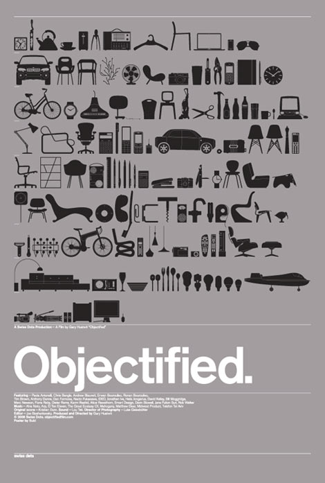
Objectified by Gary Hustwit


Do we ask ourselves why an object is made like it is? I didn’t until recently. I took for granted every item I used, from a pen to a computer, until I saw the movie Objectified. The movie helps viewers to understand the purpose of designers and how they impact the society.The director, Gary Hustwit, communicates his argument that contemporary designers and design emphasizes mass production of product more than before.


Hustwit communicates his inquiry through a collage of interviews with well-known designers like Alice Rawsthorn, Andrew Blauvelt and others. In the film Rawsthorn explains how the goal of designers was in the past to create or alter a product in order to satisfy society’s needs. This movie shows society a way to communicate with designers. It demonstrates to us how each item that we are used to seeing and using involves a long process and designer expertise to arrive at the final product we know. One example is the toothpick shown by Andrew Blauvelt; he explains that the toothpick design came from Japanese designers. These designers created a multifunctional purpose for the toothpick, since it not only includes the normal functions of the toothpick, but it also fulfills other purposes like breaking the top off the toothpick and using it as a toothpick stand. I just learned this little detail from watching the movie; it was really interesting because we take for granted that designers just decided to create a really small and slim stick that we can use to enhance our dental hygiene, when it is much more than that.

In the movie, Hutwit demonstrates how design in a contemporary period has evolved through time. It is now focused on a elaboration of mass production (which I think is mainly influenced by the global marketing and capitalism). Design now is in a constant inner war that keeps looking to enhance the "new design" to even a "newer design" to a "newest design," and creating a non-cyclical chain that might not come to an end, because we as humans will always search for perfection. This assumption has been proved by the way designers are always in search of improving existing items, like the potato peeler shown in the movie. It evolved from a metal piece with a simple design, to a more "sophisticated" version that includes a plastic handle that will be more comfortable to use and thus improve the experience of peeling potatoes.

Hutwit's film, Objectified, shows how design is a complex field, where the correlation between the end products of designers and society are closely related. Additionally, it instructs people in society to be more aware and more curious about their surroundings.

Defining the imperative: design


The goals throughout this blog have been to explain the diversified fields in design and eventually understand why design is important and how it affects society. So, in order to understand the importance of design in society, we need to recognize the definition of design. Design is in everything we see, every single item that we touch, see, and sometimes smell is created through a process of design. Design is imperative in today’s society. It is simple yet overwhelming, because in order to achieve a successful product, most designers conduct research, experimentation, in a trial-and-error process, as professor Housefield mention in class “90% perspiration, 10% inspiration." Finally, design is the way designers develop an idea into a form.

Now that we know the definition of design, we can understand why it is important. We live surrounded by materials/products created by designers for the people, where a concept has been transformed into a visual and tangible product that satisfies society’s needs. Designers observe society's needs, analyze them, and then they try to find a solution for that problem. For example, we as human beings need food in order to acquire the energy our bodies needs, then designers created utensils so we could use while eating. Then, this is the reason spoons are like spoons and forks like forks.

The way we eat, dress, and behave are all being defined by different fields of design. What we eat or the utensils we use for eating were created by designers, the way we dress is determined by the seasonal clothing manufactured by fashion designers, and the way we behave towards materialism is molded by the democratization of design.

The main goal of design is to create materials and products that will satisfy human needs. Alice Rawsthorn mentions in her article, What defies defining, but exists everywhere?, that design is a “process of conceiving and creating things in the hope of making life easier and more enjoyable” for society. People created design in order to solve problems the society encounters in daily life.

References:

http://www.nytimes.com/2008/08/18/arts/18iht-DESIGN18.1.15327742.html

Photo:

http://forkometry.wordpress.com/silver-fork-pendants/


Simplicity + Functionalism = Bauhaus.


Furniture is an importance piece in designing a space. We look for comfort and functionality. We, as a society, don’t like complexity. That is where the Bauhaus Institution comes into play.

To give you a bit of history about this institution, it was created by Weimar in Germany, in 1919. The main goal was to make student designers “recognize social responsibility to the community.” Thus, designers had to realize how the society was living and acting, what the problems were.

One member of this institution was Ludwig van der Rohe. He was a well-known architect in Germany, but after WWI he wanted to create a universal icon that revolutionized the way we see chairs.

He used this ideology of satisfying people’s needs and took it to the next level. He designed a modernized version of the chair in the 1920’s, called the Brno chair. This chair was specially invented for the owner of the Tugendhat House, in Brno. You can see more information in the Daily Icon web page.

The 1920’s chair evolved from being big, heavy, and spacious furniture that apparently was meant to be in the living room to a more simple, versatile, multifunctional chair. Van der Rohe invention has influenced the way we design furniture today, because he opened his concept of society and created a more universal item that could be used almost in every space of one's house. The Brno chair can be used in the dining room, living room, workspace, and so on. Its simple tubular form gives it a more classical and elegant look, while providing the functionality of a chair, a place to sit comfortably.

Additionally, if the Brno chair is considered to be an art piece, then it is successful art, because it not only serves functionality, but it is also aesthetically pleasing. Also, since “the artist [has] the potential to lead a viewer’s eye movement,” van der Rohe managed to guide our eyes through his piece of art through the smooth tubular frame, meaning that the object has a visual connection (Lauer, 132).

The Bauhaus institution influences today’s way of design because it emphasized the need to understand that “form is determined by content and function is priority” (Lauer, 12). It is important that the designed product executes its function, otherwise it does not matter how well the product is packaged; it would not succeed.


References:

http://en.wikipedia.org/wiki/Ludwig_Mies_van_der_Rohe

Photo:

http://www.chairmaker.co.uk/stock/easy%20chairs/1920's.htm

https://blogger.googleusercontent.com/img/b/R29vZ2xl/AVvXsEiWdTQn8xfz8ZRoQ39LgutL0f-Vc7q9-Ra3W-6s7tLeJXvWaxfGZZeCFXSLTbJjQ6Xm-vHmFGPb7hTakIcyr0X0uKg14kRmMOWSMzU-axXK0mnI4UCzGrTGupNzNxugikSKNhzUEqvgvos/s320/brno-chair.jpg

Sunday, November 1, 2009

Circles and sewing

What things are considered to be a design and what not? EVERYTHING and does not have to be create by a person with a paper saying they are Designers, why? Because design is an action and a procedure where a final product can be successfully achieved by almost everyone. The procedure is called design thinking, where the designer will notice that there is a problem (field research), then it will analyze it (understand the problem), will start to think solutions to the problem (ideas), will create a 3-D version of the solution (prototype) and will test the product. Thus, that is what the African Americans with these quilts.

It also creates a unity object by using repetition colors and patterns. Each little circle has its own form and the pattern is repeated throughout the quilt. Then, the colors also follow a pattern, where every two purple circles a series of 4 different colors of circles will follow and so on. The rhythm on this quilt is a legato rhythm because it does not cut our visual experience, our experience flows along the quilt.They identified the problem, which was that their families were suffering from cold. They thought of different ideas and create quilts from reusable materials. This is another quilt exhibited in the Richard L. Nelson Gallery & Fine Art Collection at University of California, Davis, and is called Slave’s Popcorn Quilt by the great-grandmother of

Avis Collins. You can appreciate this quilt differently from the mentioned before, in this case each unique circle was hand made, piece by piece was sewn and then put together. In this case the design offers to perceptions to the viewer: haptic and optic. It is a haptic design because, we can feel different textures, so we can apply the use of tactical sensory that helps us to get involved with the design. Also, is an optic design because we can appreciate the beauty of the design by observing the detail sewing of the material.

Therefore, is that considered to be a design? You bet! It is unique. And each person might be creating something new out of necessity, like these women, and are not even thinking of it as a piece of art. But it is, so don’t unappreciated every new thing your hands, mind, and soul create. You do not need to have a degree, or a paper, stating that the person is a Design major; every person in the society can be creative enough with restrictive materials and build designs.


References:

Richard L. Nelson Gallery & Fine Art Collection

Photos taken by Weijing

Keep yourself warmth


Quilts… Quilts, how warmth can they keep our body. That was one of the reason these African American women had in mind, while creating different quilts of recycled and reusing materials that no longer function its purpose (which is a way to be sustainable). Materials like “clothing, bedding, and flour sacks.”

The artists of these beautiful and unique quilts are women from around the 19th Century and were women whose obligations were to take care of the family. During the day by helping to plow the crops with men and at night alone or with company of other women to provide the sweet warmth with these quilts that are exhibited in the Richard L. Nelson Gallery & Fine Art Collection at University of California, Davis.

Sharecropper’s Masterpiece, is the title of the picture you see on the left and is made by Mensie Pettway of Gee’s Bend. It is a quilt done by hand with materials like “cotton corduroy, cotton batting and hand-dyed muslin.” This quilt creates a united final product through repetition of pattern and rhythm, like using the repetition of colors in each square. Also, each small square has it unique way of standing by itself that at the same time and creates the entire quilt.

By using repetition in the rips achieve a linear pattern that either goes from top to bottom or from left to right, which in combination of the staccato rhythm it gives us the opportunity to find a visual begin and end. Colorful patterns of tones of reds, pinks, purples, browns, black and white create the vibrant feeling of happiness of joy that could resemble the pleasure of the artist while creating this piece of art.

This artist did not ever think that her quilt that was meant to create warmth will ever be put in an art exhibition and be admired by so many people. But, she made it attractive by using different design techniques that helped her achieved a united visual product.

References:

Richard L. Nelson Gallery & Fine Art Collection

Photos taken by Weijing

The interactive way of communication…


I remembered one day my dad told me “don’t join those people that create a Facebook page, [this type of web pages] take away your privacy.” Would it be true? It dependents on the use each person gives to the page. There are some organizational clubs, like ASLA or ASUCD, events like Hug-A-Thon for Children’s Hope that uses this media as a way of spreading the word and letting active members and non-active to be aware of different activities. There are other people that commonly use it to me
et new people or keep in contact with the ones they have.

But, comparing this society to the centuries ago, where people were not able to communicate as we, the society of the 21st century can. Before people would write the letters, thrown into a wine bottle and then to the ocean hoping to be found and share the information. Smoke signals were sent in the air wishing to be seen. And now, social media, a way of communication where “almost” everyone, like Professor Housefiled mentioned in class, can join and that might be democratically used.

(Photo borrowed from isteconnects)

Social media is the general word to refer to this broad way of communication. You will wonder how those design fits in and I’ll tell you that in order to this types of socially web pages takes a lot of effort and time, where the final outcome of the design (the surface product, McCloud will say) will in fact attract the attention of the viewers, will be the first sell intent and where the compose information will, hopefully, engage the viewer.

Social media is not only a way of communication or a good practice of design; it is also a way to do viral marketing, meaning that this media is used to spread the word, to help other people to be aware about certain information. Additionally, it not only does all the previous but it also unites the community. Unity is an important word in design, since it is through unity where society comes to understand a message of an art/design work. Thus, unity as a whole helps the society to understand and where the repetition of information is being spread.


References:

McCloud, Scott. Understanding Comics

Isteconnects: http://www.isteconnects.org/otherpics/socialmedia1.jpg


Saturday, October 24, 2009

Harmony...

Two elderly or two young adults? Well, I will leave it to you to find out. But, this picture is a creation of Octavio Ocampo, whom named it “Solo para Siempre,” which translate, will say “Forever Always.” So, then how is it that we always end up trying to figure something out? Why we as thinkers always try to related something so it makes sense? Why not just erase the image from our minds and move forward? Well, that question was answered by a concept in psychology: Gestalt. In this concept unity helps us to visually relate what we are looking. In this picture unifying different line weights and colors Ocampo was able to create the allusion of two elderly and two young adults enjoying their time.

Unity is one important composition in designs. It is a designers’ job to create this phenomena where the viewer, in this case the society, will find the last puzzle piece for the image and relate it to the final product. There are different ways to achieve unity, but the one this blog is going to focus in order to extend this unity explanation with the picture will be proximity. We can see in this image that the artist used closeness/proximity in his composition helps us to choose what we want to see. It also helps us to create a relationship of what we are seen. Thus, connecting this relationship with designers, advertisements do the same thing.

Advertisement designs need to have a sense of organization. Designers need to walk their audience through what their main point will be. Through unity we can achieve the viewers’ attention and time to appreciate are work. If no organization or unity can be found in the work, most likely the advertisement would not have effect in the society at all. Therefore, no message will be delivered and then the designer will no longer have its job. On the other hand, architecture follows the same rule. For example if an architectural firm is designing an apartment complex in a neighborhood. They will probably want their structure to stand out and by doing so promote the apartment complex as well. In this case unity plays an important role in maintaining the similarity in their architectural structures, buildings. Same patterns, same colors, same windows, and so on. Thus, the most important thing is that we, as designers, need to connect with our audience/viewers. Maintaining not only the unity in our composition is crucial, but we need to maintain our viewers interested too.

Reference:

The photo was borrowed http://www.unoriginal.co.uk/optical_illusions/illusion5_7.jpg

Love a critique!

Have you ever received a critique and not like it? Do you wonder why do we need to critic at someone’s work? We, as human beings, do not appreciate to be pointed down. But, we need to learn that everything we do is a learning process and receiving critiques is the best way to improve. For design, as well as for art, it is crucial to receive feedback for the final products we design. Critic is one of the most resourceful ways to improve your technique, research, or even imagination.

As Lauer and Pentak wrote on their book Design Basic: “ the goal of critique is [to] increased understanding through examination of the project’s successes and shortcomings.” In other words, we need learn to appreciate other perspectives, because at the end of the game our final products are done for clients, for other people, not for ourselves. We, as designer, have to take criticism as are best judgment tool that will help us to reach the complete satisfaction of our audience and/or clients.

Additionally, during our design thinking receiving feedbacks is indispensable. One example is the company IDEO, where they created a new shopping car prototype, where the main goal was to improve the customers’ experience while shopping. The first step they followed was to do some research in groceries stores, then they started to study the problem, followed by creating new ideas, where they obtained the central idea for the new prototype that will enhance the utility. Later, after creating the new prototype, they needed to test their final product, see if the customers’ liked it, they needed feedback. If the critics received by the customers was positively they would repeat the same process, if not, they would need to repeat it and make some arrangements.

As you can see, receiving critics is important, because then designers can know what is good and bad of their designs. This obviously influences they way we as a society live day by day. Every final product of anything goes through a process of feedback/criticism that leads to how we live. For example the way we dress, the stereotypes society has created. Thus, don’t forget to appreciate any critic, do not take it personally, and instead work over it. Make it better!


References:

** The picture was borrowed from the Penguin Creative blog

http://blog.penguincreative.com/wp-content/uploads/2009/03/critics2.jpg **

Sustainability at schools


What do we learn when we attend school? How does it affect us? Do we really change? Are we being unsustainable because schools do not teach us how to be sustainable? Sustainability has become one of the answers to solve the problems our society has caused: climate changes, depletion of the earth natural resources, and so on. Therefore, educating ourselves about sustainability is imperative. One of the series of the conference was hold at the University of California, Davis on October 21st, 2009 by Doctor Geoffrey Chase. The main topic of this conference was “Sustainability Across the Curriculum: Stories and Strategies for Change,” which is seeking to educate the society more about sustainability.

Dr. Chase emphasized his conference in the importance of designing the curriculum so that students became more aware of sustainability. Then, why is it so important to emphasize it? Well, sustainability is not a topic that can be cover only through architectural buildings or sites. It involves more; it encloses economic, social, and environmental impacts. It can affect the society in two complete opposite ways: positively or negatively. Every person can be sustainable by allowing themselves to learn how to be more sustainable, like for example instead of using plastic bags for trash, they can change those plastics bags to paper bags, which will disintegrate in a shorter amount of time in comparison with the plastic bags. Then, by doing so they will allow the cycle of compost to process faster. Thus, little changes that a person can do can help to improve slowly the damage we have caused to the earth, which is the main goal of this conference.

It is important to understand how by designing differently the curriculums of schools it will influence the way current and future students can be more sustainable, which directly affects the society. Then, by re-designing the curriculum, like Dr. Chase it will be the “largest multiplier effect” because the students will influence in each homes and then the communities in where they live. If the design of the curriculum does not change and it keeps to be the way we have it, the world will be further more deplete the earth’s resources and we, the society, will destroy the planet and ourselves by doing so.

References:

The poster was printed out by UC Davis, Design department

Tuesday, October 13, 2009

Umbrellas!!


It is raining again! In my way to class, the air turned the umbrella inside out and one stretcher broke because of it. As I walked to my second class my jeans were completely wet and the umbrella was no longer functional. I had to hold the stretcher that broke in order for me to “not get wet.” I put it under quotation marks, because innocently I thought I would not get soaking wet. At the end, I had to go buy a new and bigger umbrella. Thus, this blog is in honor to those dysfunctional umbrellas that were meant to protect us from getting wet from those raining days.

Then, who thought we needed umbrellas? How did the design thinking started? Why its design is the way it is? Well, according to the article The History of the Umbrella, written by Abby Eyers, the umbrella was invented 4,000 years ago. Its primary function was to provide shade and it was an item that only high-class society used and “the larger the umbrella, the greater the wealth of its owner.” As we moved through time different places around the world started to understand the problem society had with not sheltering themselves from the rain. People got sick more often. Thus, the function of the umbrella started to change; society gave it the purpose of protecting us from water.

The ideas and prototypes were taken from past centuries, so the only thing that was need to be done was to find a permeable material and the strength of a material that would be able to fold and “hold” the umbrella in that inverted u-shape. But, it was not easy for people to adapt to this new protecting device. Man at first did not agree with the idea of using what was meant for only women use.

On the other hand, the umbrella’s design needs to change because it does not provide enough protection. And the stretchers need to be stronger so the wind does not turn it inside out. But, I’m sure someone will change the prototype and we will find the perfect protection against rain. Like this one:

**The information and the picture were taken from this website: http://www.associatedcontent.com/article/26690/the_history_of_the_umbrella_pg2.html?cat=46**

** The video was borrowed from youtube.com**


**The information and the picture were taken from this website: http://www.associatedcontent.com/article/26690/the_history_of_the_umbrella_pg2.html?cat=46**

** The video was borrowed from youtube.com**

Nature in Art

I am an artist that values, above all, the ability of art to move me emotionally and psychically. I make art that makes me question, that derives its power from being vulnerable to interpretation, that is intuitive, that is beautiful. 

-April Gornik

Aesthetical pleasing and the impact the art on the audience is important for April Gornik. An artist who’s inspiration is nature and cares for her audience reactions toward her art. Gornik’s art influences her audience feelings. She designs her art respecting nature and admiring it. She gives live to each printing with different mediums. She uses from 3-5 colors in her lithographic printings and with this media she gives a unique personality to her portrait and her audience can clearly perceive it.

One example of how engaging her paintings can be is “Sky Through Trees,” each silhouette has its own form; there are no repetitions or patterns. It resembles each human being, every single one of us are unique. Her inspiration (nature) is turn into a passionate and uniformly tone in a printing. Going back to the example, this printing is on a grayscale. The trees pop out of the page by simply being black under a gray tone background.

Being in a society where the majority of us no longer appreciate nature, April Gornik creates a nice job at bringing us back to where we started. She helps us to realize the beauty of what we need to preserve for future generations. There’s no need to have a compacted design that will enclose a lot of details, it only needs to be balance and make sense.

** The pictures and the quote were borrowed from her web page: http://www.aprilgornik.com/book.html**

Monday, October 12, 2009

Another way of use for colors.

Are make-up artists considered to be artists? If so, are they considered to be designers? I think they do, because they create new trends every time they work with colors and brushes each season. It is like painting, but instead of having a white canvas, they have a face, and the art does not last more than a couple hours. One artist is Salina Marie, whose inspiration is color. She mentions in an interview that color gives her the urge to “experiment with different colors [and] made [her] want to do more with tools,” and not just painting.


Color was her main inspiration to actually become a make-up artist. She plays with a range of tones in order to achieve a satisfactory make-up. And it obviously varies with each skin tone her clients have. It is not a simple task to do, combining the right colors and tones for the occasion takes practice. Additionally, each season the trends change and therefore the color tones and techniques will change too.

This make-up process takes the action of thinking and imaging how the end result is going to be. As the process of brushing the color into the skin, it requires the artist to stop for a second, look at their process, and make corrections before it’s too late. The artist goes back to their project and then the client will critique the artist’s work. Finally, if little corrections have to be done in order to have a satisfactory result, changes will be done.

Nothing in life is easy to do. It takes different levels of processes. But it does not mean it is impossible to do.

** The image was taken from http://ferenc.biz/archives/painter-make-up-artist-salina-marie-interview/**

Sunday, October 11, 2009

Cell Phones Evolution

Have you ever look the progression of the cell phone’s designs? Back in 1990’s, I remembered having a Nokia cell phone, 5 inches long and almost an inch wide. It looked like a tiny brick. Designed only to make phone calls and few text messaging, with an ABC writing format, which means that you would click several times the same key in order to have the letter you wanted to be shown in the cell phone’s screen. But, back in 1980’s the first cell phone was even bigger and, according to the eighties online, it was actually referred as “the brick.”

In about ten years the cell phone’s design changed dramatically, the size was smaller (not smaller as some phones we have now) than it initially was. Then, as time progressed cell phones got increasingly acceptable and versatile. Size no longer determined the functionality of the cell phone. There were cell phones even smaller than someone’s palm with the entire programs and options of another cell phone.


Then how design influenced this “human’s necessity?” Well, when cell phones started to be invented society was not as much dependent on technology as we are today. As time progressed, society needed more convenient and compact goods. Nowadays, there cell phones, like Iphone, Blackberry Storm, and so on, which no longer have keyboards in it. Society is requiring more condensed and multifunctional accessories. There is no need to waste that extra money to create the plastic keyboards. The cell phone screen can be set up so that responds to one’s touch. The same goes with how new computers designs are being made. Hewlett-Packard is one company that has changed their computers designs the computer screen to respond to the users’ touch.


The cell phones, these contemporary societies have, are created and designed so that it can hold different programs on it. We not only can do primary services of this product: make phone

and send text messages, where we no longer need to click several times in the keyboard, the cell phone now will know the word we want to use, but also can send e-mails, navigate on the web, take photos or videos, and even find our location in the world. And cell phones are going to keep evolving, it might become even thinner, compacted, and convenient and designers will play an important role in deciding how the new image of the human’s dependency will be.


***Photos were taken from the internet, the references: ***

http://www.eightiesonline.com/eighties-news-and-information/the-first-cell-phone-call-25-years-ago-in-1983

http://www.gearcrave.com/2008-12-02/the-history-of-blackberry-six-rims-from-black-to-bold/

http://images.google.com/imgres?imgurl=http://images.businessweek.com/ss/08/07/0717_idea_winners/image/g_iphone.jpg&imgrefurl=http://images.businessweek.com/ss/08/07/0717_idea_winners/23.htm&usg=__6jgn_vOFUYqUzyRX5x8a7Ha5gOE=&h=350&w=600&sz=81&hl=en&start=4&sig2=4b-0Eu2hRYMN64VTbmQZ2Q&um=1&tbnid=myl9OArKbYSAXM:&tbnh=79&tbnw=135&prev=/images%3Fq%3Diphone%26hl%3Den%26client%3Dsafari%26rls%3Den%26sa%3DN%26um%3D1&ei=JVPSSojjGIbatAOeuOzvCw

http://i.testfreaks.es/images/products/600x400/81/panasonic-gd55.24657.jpg